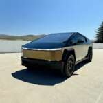
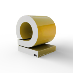
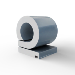
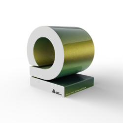
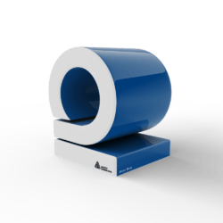
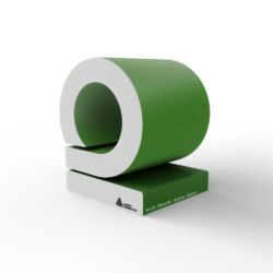
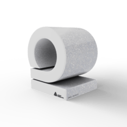
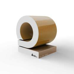
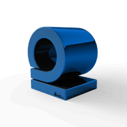
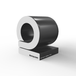
PWF
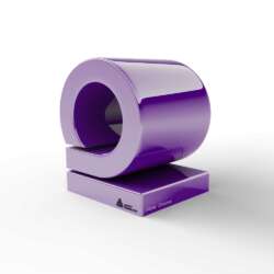
matte Lizard Lime
pwf - matte Lizard Lime
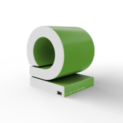
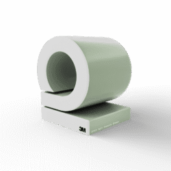
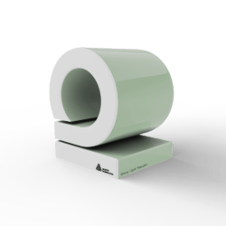
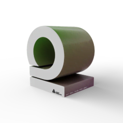
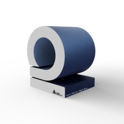
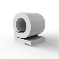
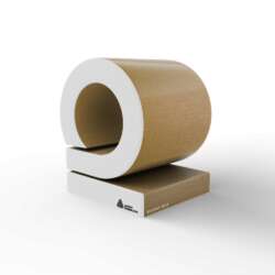
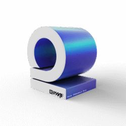
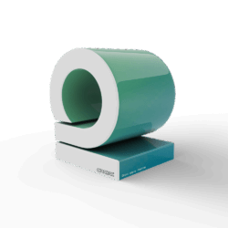
INTERIOR DECOR
EVOLV NF32
interior-decor - EVOLV NF32
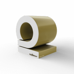
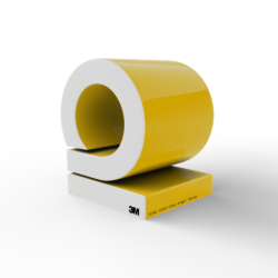
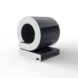
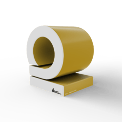
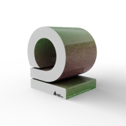
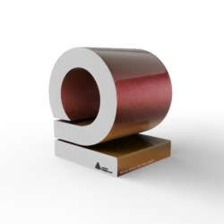
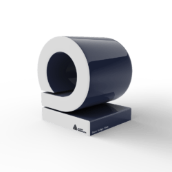
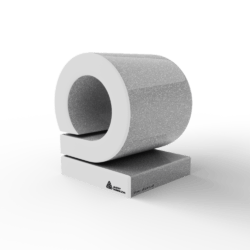
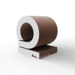
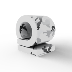
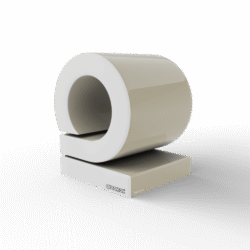
TECKWRAP
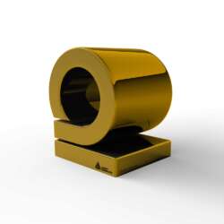
Bond Gold
teckwrap - Bond Gold
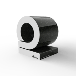
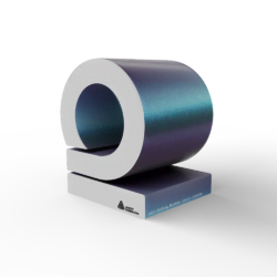
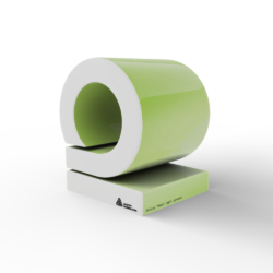
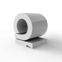
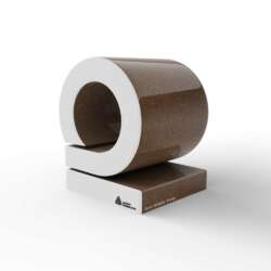
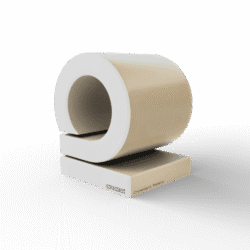
INOZETEK
Super Gloss Chalk Grey
inozetek - Super Gloss Chalk Grey
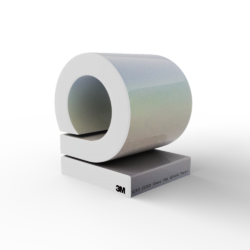
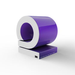
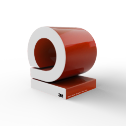
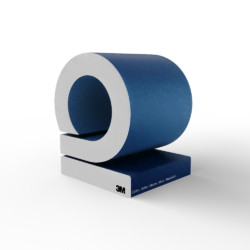
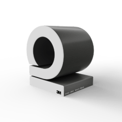
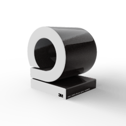
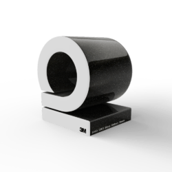
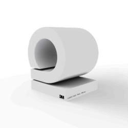
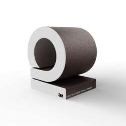
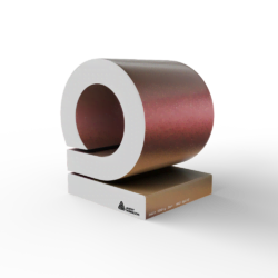
3M
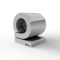
gloss silver chrome
3m - gloss silver chrome
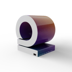
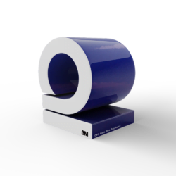
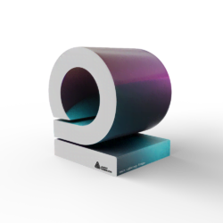
3M
Satin Flip Psychedelic
3m - Satin Flip Psychedelic
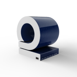
3M
Gloss Flip Psychedelic
3m - Gloss Flip Psychedelic
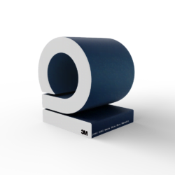
3M
Satin Flip Ghost Pearl
3m - Satin Flip Ghost Pearl
3M
Gloss Flip Ghost Pearl
3m - Gloss Flip Ghost Pearl
3M
Satin Flip Caribbean Shimmer
3m - Satin Flip Caribbean Shimmer
3M
Satin Flip Glacial Frost
3m - Satin Flip Glacial Frost
3M
Gloss Flip Electric Wave
3m - Gloss Flip Electric Wave
3M
Gloss Flip Deep Space
3m - Gloss Flip Deep Space
3M
Satin Flip Volcanic Flare
3m - Satin Flip Volcanic Flare
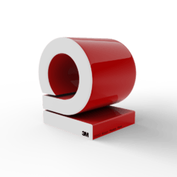
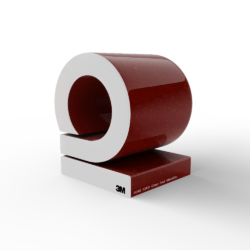
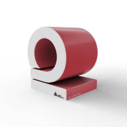
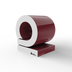
3M
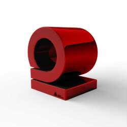
Matte Red
3m - Matte Red
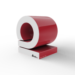
3M
Gloss Hotrod Red
3m - Gloss Hotrod Red
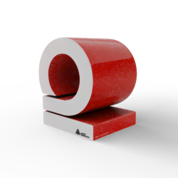
3M
Gloss Flame Red
3m - Gloss Flame Red
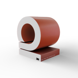
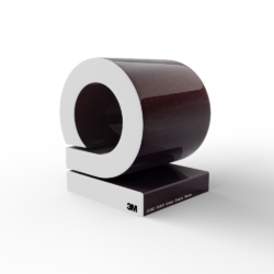
3M
Gloss Dark Red
3m - Gloss Dark Red
3M
Satin Smoldering Red
3m - Satin Smoldering Red
3M
Gloss Dragon Fire Red
3m - Gloss Dragon Fire Red
3M
Matte Red Metallic
3m - Matte Red Metallic
3M
Gloss Red Metallic
3m - Gloss Red Metallic
3M
Satin Vampire Red
3m - Satin Vampire Red
3M
Gloss Cinder Spark Red
3m - Gloss Cinder Spark Red
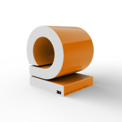
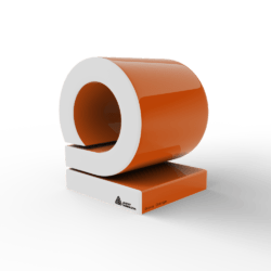
3M
Matte Orange
3m - Matte Orange
3M
Gloss Bright Orange
3m - Gloss Bright Orange
3M
Gloss Deep Orange
3m - Gloss Deep Orange
3M
Gloss Burnt Orange
3m - Gloss Burnt Orange
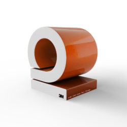
3M
Satin Canyon Copper
3m - Satin Canyon Copper
3M
Gloss Liquid Copper
3m - Gloss Liquid Copper
3M
Gloss Fiery Orange
3m - Gloss Fiery Orange
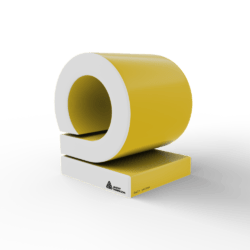
3M
Gloss Lucid Yellow
3m - Gloss Lucid Yellow
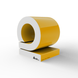
3M
Gloss Bright Yellow
3m - Gloss Bright Yellow
3M
Gloss Sunflower
3m - Gloss Sunflower
3M
Satin Bitter Yellow
3m - Satin Bitter Yellow
3M
Gloss Lemon Sting
3m - Gloss Lemon Sting
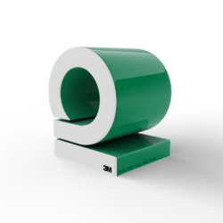
3M
Gloss Light Green
3m - Gloss Light Green
3M
Satin Apple Green
3m - Satin Apple Green
3M
Gloss Green Envy
3m - Gloss Green Envy
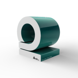
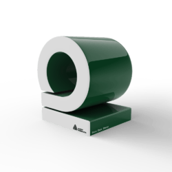
3M
Gloss Kelly Green
3m - Gloss Kelly Green
3M
Matte Pine Green Metallic
3m - Matte Pine Green Metallic
3M
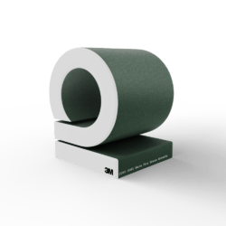
Matte Military Green
3m - Matte Military Green
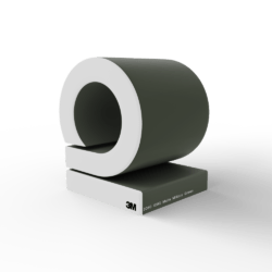
3M
Shadow Military green
3m - Shadow Military green
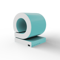
3M
Gloss Atomic Teal
3m - Gloss Atomic Teal
3M
Satin Ocean Shimmer
3m - Satin Ocean Shimmer
3M
Satin Key West
3m - Satin Key West
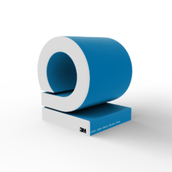
3M
Gloss Sky Blue
3m - Gloss Sky Blue
3M
Matte Riviera Blue
3m - Matte Riviera Blue
3M
Matte Blue Metallic
3m - Matte Blue Metallic
3M
Gloss Blue Metallic
3m - Gloss Blue Metallic
3M
Satin Perfect Blue
3m - Satin Perfect Blue
3M
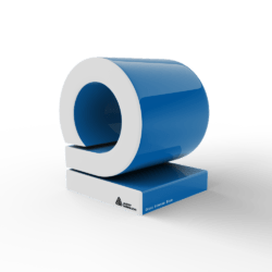
Gloss Intense Blue
3m - Gloss Intense Blue
3M
Gloss Blue Fire
3m - Gloss Blue Fire
3M
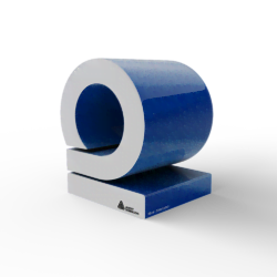
Gloss Cosmic Blue
3m - Gloss Cosmic Blue
3M
Gloss Blue Raspberry
3m - Gloss Blue Raspberry
3M
Gloss Deep Blue Metallic
3m - Gloss Deep Blue Metallic
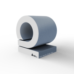
3M
Matte Slate Blue Metallic
3m - Matte Slate Blue Metallic
3M
Gloss Ice Blue
3m - Gloss Ice Blue
3M
Gloss Glacier Grey
3m - Gloss Glacier Grey
3M
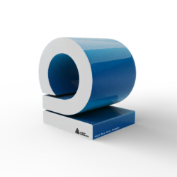
Gloss Midnight Blue
3m - Gloss Midnight Blue
3M
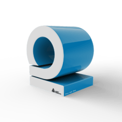
Gloss Boat Blue
3m - Gloss Boat Blue
3M
Matte Indigo
3m - Matte Indigo
3M
Gloss Plum Explosion
3m - Gloss Plum Explosion
3M
Gloss Wicked
3m - Gloss Wicked
3M
Gloss Hot Pink
3m - Gloss Hot Pink
3M
Gloss Fierce Fuchsia
3m - Gloss Fierce Fuchsia
3M
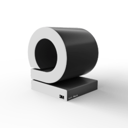
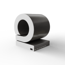
Matte Black
3m - Matte Black
3M
Dead Matte Black
3m - Dead Matte Black
3M
Matte Deep Black
3m - Matte Deep Black
3M
Matte Black metallic
3m - Matte Black metallic
3M
Matrix Black
3m - Matrix Black
3M
Shadow Black
3m - Shadow Black
3M
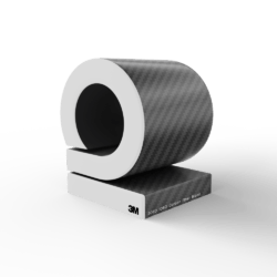
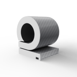
Carbon Fiber Black
3m - Carbon Fiber Black
3M
Brushed Black Metallic
3m - Brushed Black Metallic
3M
Satin Black
3m - Satin Black
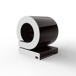
3M
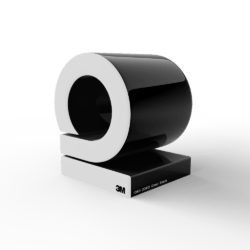
Gloss Black
3m - Gloss Black
3M
Black gloss metallic
3m - Black gloss metallic
3M
Satin Gold Dust Black
3m - Satin Gold Dust Black
3M
Gloss Black Rose
3m - Gloss Black Rose
3M
Gloss Ember Black
3m - Gloss Ember Black
3M
Gloss Galaxy Black
3m - Gloss Galaxy Black
3M
Satin White Aluminum
3m - Satin White Aluminum
3M
Gloss White Aluminium
3m - Gloss White Aluminium
3M
Brushed Aluminium
3m - Brushed Aluminium
3M
Gloss Storm Grey
3m - Gloss Storm Grey
3M
Satin Battleship Gray
3m - Satin Battleship Gray
3M
Gloss Sterling Silver
3m - Gloss Sterling Silver
3M
Matte Silver
3m - Matte Silver
3M
Carbon Fiber Anthracite
3m - Carbon Fiber Anthracite
3M
Brushed Steel
3m - Brushed Steel
3M
Gloss Anthracite
3m - Gloss Anthracite
3M
Satin Thundercloud
3m - Satin Thundercloud
3M
Matte Grey Aluminium
3m - Matte Grey Aluminium
3M
Brushed Titanium
3m - Brushed Titanium
3M
Matte Charcoal Metallic
3m - Matte Charcoal Metallic
3M
Gloss Charcoal Metallic
3m - Gloss Charcoal Metallic
3M
Matte Dark Grey
3m - Matte Dark Grey
3M
Satin Dark Grey
3m - Satin Dark Grey
3M
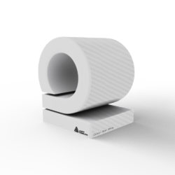
Matte White
3m - Matte White

3M
Satin white
3m - Satin white
3M
Gloss White
3m - Gloss White
3M
Carbon Fiber White
3m - Carbon Fiber White
3M
Satin Frozen Vanilla
3m - Satin Frozen Vanilla
3M
Gloss White Gold Sparkle
3m - Gloss White Gold Sparkle
3M
Satin Pearl White
3m - Satin Pearl White
3M
Gloss Light Ivory
3m - Gloss Light Ivory
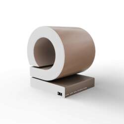
3M
Satin Caramel Luster
3m - Satin Caramel Luster
3M
Gloss Gold Metallic
3m - Gloss Gold Metallic
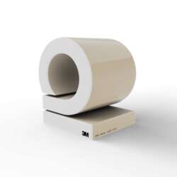
3M
Matte Copper Metallic
3m - Matte Copper Metallic
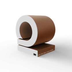
3M
Matte brown Metallic
3m - Matte brown Metallic
3M
Satin Komodo Green
3m - Satin Komodo Green
Avery
Satin-Hope-green
avery - Satin-Hope-green
Avery
Matte Olive Green
avery - Matte Olive Green
Avery
Satin Dark Basalt
avery - Satin Dark Basalt
Avery
Gloss Rock Grey
avery - Gloss Rock Grey
Avery
Satin Safari gold
avery - Satin Safari gold
Avery
Gloss sand Sparkle
avery - Gloss sand Sparkle
Avery
Gloss Metallic Spark
avery - Gloss Metallic Spark
Avery
Gloss Metallic Magnetic Burst
avery - Gloss Metallic Magnetic Burst
Avery
Gloss Metallic Radioactive
avery - Gloss Metallic Radioactive
Avery
Gloss Eclipse Metallic
avery - Gloss Eclipse Metallic
Avery
Glossy Cloudy Blue
avery - Glossy Cloudy Blue
Avery
Glossy Light Pistachio
avery - Glossy Light Pistachio
Avery
Glossy Sea-Breeze Blue
avery - Glossy Sea-Breeze Blue
Avery
Glossy Smoky Blue
avery - Glossy Smoky Blue
Avery
Satin Lightning Ridge
avery - Satin Lightning Ridge
Avery
Glossy Lightning Ridge
avery - Glossy Lightning Ridge
Avery
Satin Fresh Spring gold silver
avery - Satin Fresh Spring gold silver
Avery
Glossy Fresh Spring gold:silver
avery - Glossy Fresh Spring gold:silver
Avery
Satin Urban Jungle silver green
avery - Satin Urban Jungle silver green
Avery
Glossy Urban Jungle silver:green
avery - Glossy Urban Jungle silver:green
Avery
Satin Roaring Thunder blue red
avery - Satin Roaring Thunder blue red
Avery
Glossy Roaring Thunder blue red
avery - Glossy Roaring Thunder blue red
Avery
Satin Rushing Riptide cyaan purple
avery - Satin Rushing Riptide cyaan purple
Avery
Glossy Rushing Riptide cyaan purple
avery - Glossy Rushing Riptide cyaan purple
Avery
Satin Rising Sun red gold
avery - Satin Rising Sun red gold
Avery
Glossy Rising Sun red gold
avery - Glossy Rising Sun red gold
Avery
Glossy Ambulance Yellow
avery - Glossy Ambulance Yellow
Avery
Glossy Yellow
avery - Glossy Yellow
Avery
Satin yellow
avery - Satin yellow
Avery
Glossy Dark Yellow
avery - Glossy Dark Yellow
Avery
Glossy pearl Gold Orange
avery - Glossy pearl Gold Orange
Avery
Matte Metallic Blaze Orange
avery - Matte Metallic Blaze Orange
Avery
Glossy Orange
avery - Glossy Orange
Avery
Satin Orange
avery - Satin Orange
Avery
Matte Orange
avery - Matte Orange
Avery
Gloss Cardinal Red
avery - Gloss Cardinal Red
Avery
Satin Cardinal Red
avery - Satin Cardinal Red
Avery
Gloss Carmine Red
avery - Gloss Carmine Red
Avery
Satin Carmine Red
avery - Satin Carmine Red
Avery
Gloss Red
avery - Gloss Red
Avery
Gloss Soft Red
avery - Gloss Soft Red
Avery
Red diamond
avery - Red diamond
Avery
Gloss pearl red
avery - Gloss pearl red
Avery
Matte Metallic Cherry
avery - Matte Metallic Cherry
Avery
Matte Metallic Garnet Red
avery - Matte Metallic Garnet Red
Avery
Gloss Burgundy
avery - Gloss Burgundy
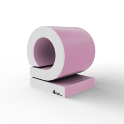
Avery
Satin Bubblegum pink
avery - Satin Bubblegum pink
Avery
Matte Metallic Pink
avery - Matte Metallic Pink
Avery
satin metallic purple
avery - satin metallic purple
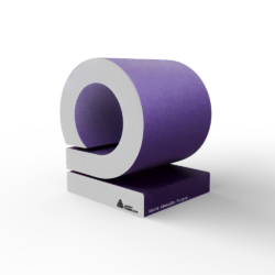
Avery
Matte Metallic Purple
avery - Matte Metallic Purple
Avery
Purple diamond
avery - Purple diamond
Avery
Matte Metallic Powder Blue
avery - Matte Metallic Powder Blue
Avery
Matte Metallic Frosty Blue
avery - Matte Metallic Frosty Blue
Avery
Gloss Light Blue
avery - Gloss Light Blue
Avery
satin light blue
avery - satin light blue
Avery
Bright Blue Gloss Metallic
avery - Bright Blue Gloss Metallic
Avery
Blue diamond
avery - Blue diamond
Avery
Gloss Intense Blue
avery - Gloss Intense Blue
Avery
Gloss Blue
avery - Gloss Blue
Avery
Gloss Dark Blue
avery - Gloss Dark Blue
Avery
satin dark blue
avery - satin dark blue
Avery
Matte Metallic Brilliant Blue
avery - Matte Metallic Brilliant Blue
Avery
Matte Metallic Blue
avery - Matte Metallic Blue
Avery
Matte Metallic Night Blue
avery - Matte Metallic Night Blue
Avery
Gloss Indigo Blue
avery - Gloss Indigo Blue
Avery
Gloss Dark Blue Metallic
avery - Gloss Dark Blue Metallic
Avery
Glossy Pearl light green
avery - Glossy Pearl light green
Avery
Gloss Lime Green
avery - Gloss Lime Green
Avery
Gloss Grass Green
avery - Gloss Grass Green
Avery
satin grass green
avery - satin grass green
Avery
Matte Metallic Apple Green
avery - Matte Metallic Apple Green
Avery
Gloss pearl Dark Green
avery - Gloss pearl Dark Green
Avery
Gloss Dark Green
avery - Gloss Dark Green
Avery
Satin Khaki Green
avery - Satin Khaki Green
Avery
Matte Khaki Green
avery - Matte Khaki Green
Avery
Carbon Fiber White
avery - Carbon Fiber White
Avery
Gloss White
avery - Gloss White
Avery
Satin White
avery - Satin White
Avery
Matte White
avery - Matte White
Avery
Gloss pearl white
avery - Gloss pearl white
Avery
Satin pearl white
avery - Satin pearl white
Avery
White diamond
avery - White diamond
Avery
Silver Gloss metallic
avery - Silver Gloss metallic
Avery
Gloss Metallic Quick Silver
avery - Gloss Metallic Quick Silver
Avery
Satin Silver Metallic
avery - Satin Silver Metallic
Avery
Matte Metallic Silver
avery - Matte Metallic Silver
Avery
Silver diamond
avery - Silver diamond
Avery
Brushed Aluminium
avery - Brushed Aluminium
Avery
Gloss Grey
avery - Gloss Grey
Avery
Satin grey
avery - Satin grey
Avery
Brushed Titanium
avery - Brushed Titanium
Avery
Matte Metallic Anthracite
avery - Matte Metallic Anthracite
Avery
Gloss Dark Grey
avery - Gloss Dark Grey
Avery
Matte Dark Grey
avery - Matte Dark Grey
Avery
Matte Metallic Gunmetal
avery - Matte Metallic Gunmetal
Avery
Matte Metallic Charchoal
avery - Matte Metallic Charchoal
Avery
Brushed Steel
avery - Brushed Steel
Avery
Gloss metallic Grey
avery - Gloss metallic Grey
Avery
Carbon Fiber Black
avery - Carbon Fiber Black
Avery
Gloss Black
avery - Gloss Black
Avery
Satin Black
avery - Satin Black
Avery
Matte Black
avery - Matte Black
Avery
Gloss Metallic Black
avery - Gloss Metallic Black
Avery
Brushed Black
avery - Brushed Black
Avery
Gloss Gold metallic
avery - Gloss Gold metallic
Avery
Diamond Amber
avery - Diamond Amber
Avery
Brushed Bronze
avery - Brushed Bronze
Avery
Matte metallic Brown
avery - Matte metallic Brown
Avery
Gloss Metallic Brown
avery - Gloss Metallic Brown
Avery
Satin Rock Grey Metallic
avery - Satin Rock Grey Metallic
Avery
Rose Gold Chrome
avery - Rose Gold Chrome
Avery
Violet Chrome
avery - Violet Chrome
Avery
Matt silver Chrome
avery - Matt silver Chrome
Avery
silver Chrome
avery - silver Chrome
Avery
Gold Chrome
avery - Gold Chrome
Avery
Red Chrome
avery - Red Chrome
Avery
Blue Chrome
avery - Blue Chrome
Avery
Black Chrome
avery - Black Chrome
KPMF
Satin Stealth Tundra
kpmf - Satin Stealth Tundra
KPMF
Matte Black
kpmf - Matte Black
KPMF
Metro Matte Violaceous Blue
kpmf - Metro Matte Violaceous Blue
Custom Colors
Aspen snowcamo
customcolors - Aspen snowcamo
Custom Colors
custom printed
customcolors - custom printed
Custom Colors
discontinued color
customcolors - discontinued color
Custom Colors
muttha purple
customcolors - muttha purple
Custom Colors
Carbon PP2 Glossy
customcolors - Carbon PP2 Glossy
Custom Colors
Carbon PP2 Matte
customcolors - Carbon PP2 Matte
Oracal
Aquamarine
oracal - Aquamarine
Oracal
Papyrus
oracal - Papyrus
Oracal
Charcoal Metallic
oracal - Charcoal Metallic
Oracal
Champagne Metallic
oracal - Champagne Metallic
Paint Protection Film
Premiumshield Glossy
paint-protection-film - Premiumshield Glossy
Paint Protection Film
Premiumshield Matt
paint-protection-film - Premiumshield Matt
APA / EVOLV
Gloss Supercandy Burgundy
apa - Gloss Supercandy Burgundy
APA / EVOLV
Black Velvet
apa - Black Velvet
APA / EVOLV
Black Olive
apa - Black Olive
oops! No Colors found. Try another filter or Reset filter
 Automotive
 Car Wrap
 Paint Protection
 Racing Stripes
 design wrap
 accent wrap
 Window Tinting
 Windshield Protection
 Smoked lights
 Wheels
 Ceramic Coating
 Explore
 Advertising
 Fleet Marketing
 Window Graphics
 Graphic Designing
 Printing
 Custom Signs
 Architectural
 Building Wraps
 Canvas Printing
 Furniture Wrapping
 Wall Wrapping
 Nautical
 Marine Exterior wrap
 Marine Interior wrap
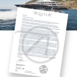 Referal Letter Aquila Yacht
 carwrap simulator
 Colors
 3D CARWRAP CONFIGURATOR
 Colors
 Pricing
 Locations
 USA-California
 BELGIUM-WEELDE
 BELGIUM-TURNHOUT
 Netherlands
 Contact
 contact us
 Job Offers
 Freelance
 info
info About Us
 social media
 faq’s
faq’s videos
 FAQ blogs
 Charity
 reviews